The sword goes slanting and the front makes the proportion stacking chart with color
In Excel, we often use the proportion stacking chart to express the budget, the proportion of each part of the expenditure and other data. The default proportion stacking chart is to determine the length or area of ​​the column according to the size of the proportion, and then simply stack them together. In fact, with the popularity of visual design today, we can also achieve stacked charts entirely through color and color depth. This is not only beautiful, but also makes the visualization more prominent.
For example, the following table shows the hospitality expenses reimbursed by various departments of a unit. In order to more intuitively see the accumulation of hospitality expenses in each department, you can now use conditional formatting to fill cells with different colors to achieve a stacked chart.
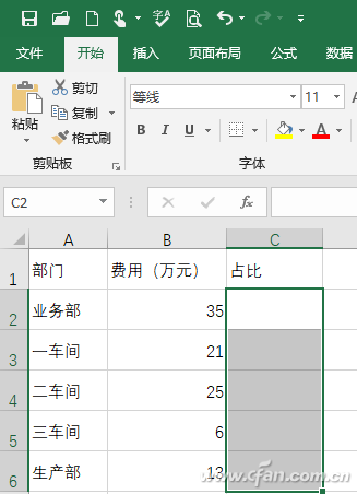
Raw data
First, sum up the total entertainment expenses, then enter the formula "=(B2/B$7)*100%" in C2, and pull down the formula to obtain the respective proportions of the entertainment expenses of each unit.
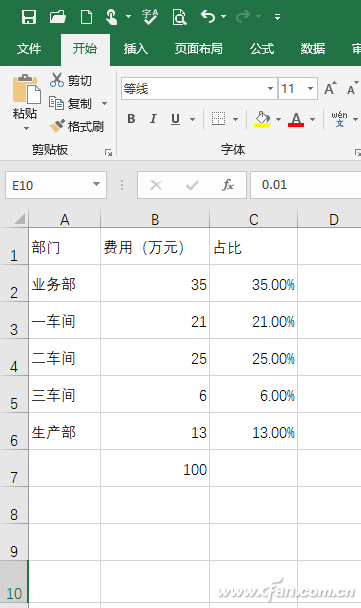
Proportion data
Select the E1:N10 area, click "Start → Format → Row Height", set it to 28, and continue to set the column height to "4". That is, select a 10*10 cell as the fill area for color stacking.
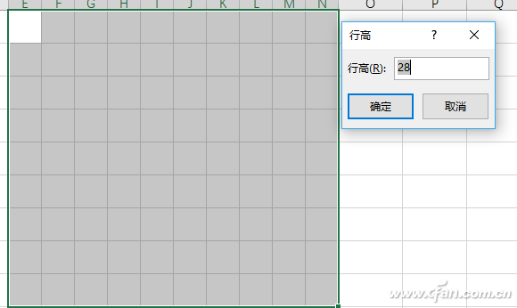
Select fill area
Then enter "0.91" in E1, click "Start → Fill → Sequence → Arithmetic Sequence", enter "0.01" for the step value, enter 1 for the end value, and click "OK" to complete the input of the row sequence. Enter "0.81" in E2, and the operation is the same as above to complete the input of the sequence, and then select the filled two rows of the sequence to fill down to complete the input of all data. Here, each cell corresponds to a percentage, the initial E10=0.01 (ie 1%), and then progressively in steps of 1% until 100%, so that the percentage of the original hospitality fee can be represented by the cell.
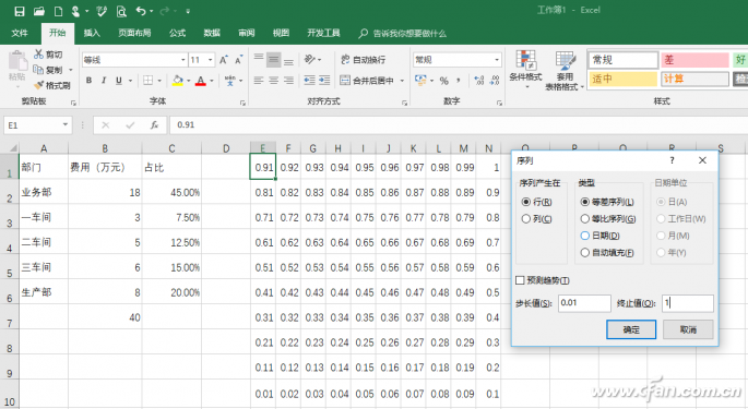
Select fill area
Click "Start→Conditional Formatting→Highlight Cell Rules→Other Rules", and click "Format only cells that contain the following" in the opened window. Under the edit rule description, select "Cell Value", "Less Than or Equal", and then enter the formula "=SUM($C$3:$C$6" in the back. Continue to click "Format" and set the fill format to red. Here Use the $ symbol to make an absolute reference to a cell, which means that if the value of the cell is less than or equal to the sum of C3:C6, then the conditional formatting settings are applied.
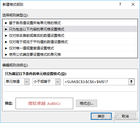
Conditional formatting
Continue to set the remaining 3 rules, the others are the same as above, the formulas are "=SUM($C$4:$C$6", "=SUM($C$5:$C$6", "=$C$6". Then click "Format", set different colors for different rules, the application range is all set to $E$1:$N$10, you can set all rules in sequence in the management rules.
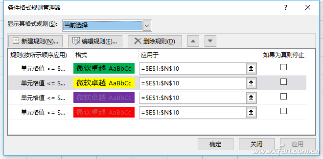
management rules
Click OK to apply the rules, so that each cell will be filled according to the above rules. In order to make the data more beautiful, select the E1:N10 area, right-click the cell and select "Format Cell→Number→Custom", and enter ";;;" (three half-width fraction format) in the "Type" box to indicate the hidden cell grid number format.
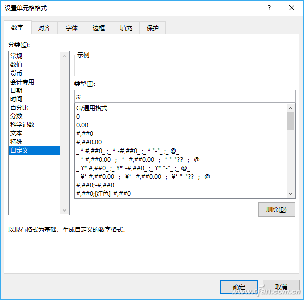
set number format
Now go back to the cell and you can see that the original numbers have been hidden. The cells with different colors actually correspond to the percentages of each department. When we change the actual numbers, the cells with different percentages will change synchronously. In this way, through the number of cells with different colors, you can easily see the proportion of hospitality expenses in different departments. For easier viewing, you can also add text descriptions of each department next to the cells. Is this color stacked chart a visual effect? better?
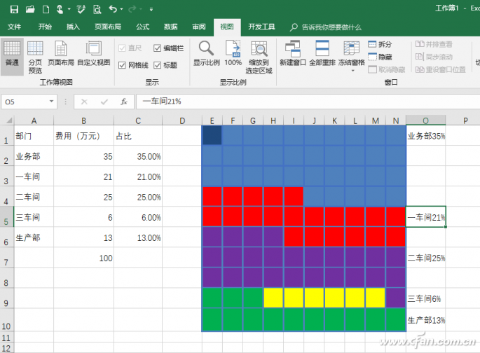
Stacked chart in cell style
It can be seen that the flexible use of conditional formatting can be very convenient to use cells to represent the proportion of numbers, and we can also draw inferences from one case to make more graphics. For example, you can directly use the data bar to represent the proportion of entertainment expenses. As above, click "Start → Conditional Formatting → Data Bar → Other Rules", select "Format all cells based on their respective values" in the opened window, and set the minimum and maximum values ​​of the type to "Number", and the values ​​are 0 and 1, choose red and solid borders for the appearance of the bar chart.
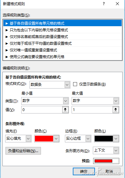
Data bar settings
After clicking OK, you can see that a red data bar corresponding to the percentage value will be added after each percentage value. You can intuitively see the difference in value through the length of the data bar.
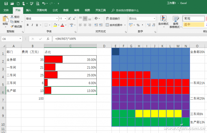
Use the data bar to directly represent the proportion
Lithium (CAS No.14258-72-1) Li is a silver-white metal with soft, large toughness, good ductility, and the least density metal. The relative atomic mass of lithium is 6.94, the density is 0.534g/cm3, and the melting point is 180°C. It can react with a large number of inorganic reagents and organic reagents. It is extremely unstable in nature, variable in the event of air, and can react violently with water. Because the atomic weight of lithium is very small, the battery with lithium as an anode has the advantages of high energy, high circulation life, small volume, light quality, high charging, and discharging rate, no memory effect, simple maintenance, long storage life, green and environmental protection. In addition, the battery field has become the largest application field of lithium.
Ultrathin Lithium Ribbon,Ultra-Thin Lithium Belthigh Energy Density,0.1 0.2Mm Ultra-Thin Lithium Button Battery Material,0.1 0.2Mm Ultra-Thin Li Thermal Battery Material
Shandong Huachuang Times Optoelectronics Technology Co., Ltd. , https://www.dadncell.com
